Ericka Lewis
“We emphasize that such a form of communication is not absent in man, however evanescent a naturally given object may be for him, split as it is in its submission to symbols.”
- Jacques Lacan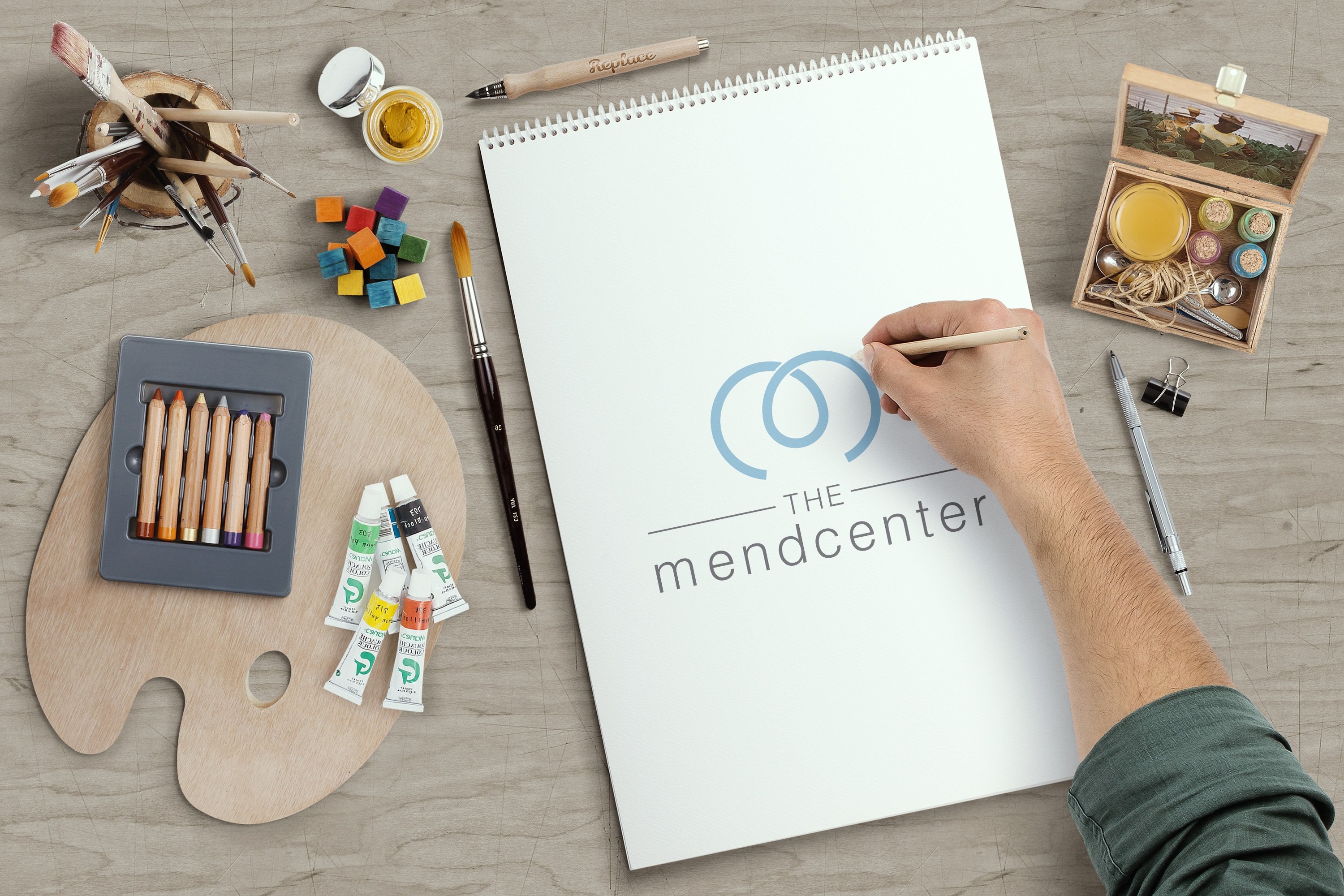 The Challenge
"Dr. Dan", as our team endearingly refers to him, owns a Houston-based psychology practice. Looking to refresh his brand assets to better convey his unique treatment method and his philosophy, Dr. Dan approached Adhere Creative.
From previously being known as the "River Oaks Psych Center" our team rebranded his practice to the new and more fitting name, "The Mend Center" -- a nod to Dr. Dan's advocacy to mending the lives of psychotic patients by enabling them to live a full and functional life in spite of their affliction. Through enlightening talks with Dr. Dan, our team discovered just how unique and transformative his treatment approach is. This prompted us to brand his treatment, "The Transforma Method."
The Impactful Design
Unlike most psychologists, Dr. Daniel Garcia, Ph.D., M.T.S., subscribes to the philosophy and teachings of the controversial French psychoanalyst and pyschiatrist, Jacques Lacan. Because Dr. Dan's philosophy and clinical approach revolved around Lacan's philosophy and studies, it was integral for our team to convey this in the Mend Center and Transforma Method's logos.
The Mend Center Logo
![]() We designed the Mend Center's logo with the lowercase Greek alphabet omega in mind. If you look closely, the vector is an upside down lowercase omega. Why? The omega is the last letter of the Greek alphabet and as such, usually taken to signify "the end". We chose the upside down omega to denote that while patients afflicted with psychosis as well as their loved ones may feel that this condition is the harbinger of "end" -- end of normality, end of a happy life, end of their hopes and dreams -- it is not.
We designed the Mend Center's logo with the lowercase Greek alphabet omega in mind. If you look closely, the vector is an upside down lowercase omega. Why? The omega is the last letter of the Greek alphabet and as such, usually taken to signify "the end". We chose the upside down omega to denote that while patients afflicted with psychosis as well as their loved ones may feel that this condition is the harbinger of "end" -- end of normality, end of a happy life, end of their hopes and dreams -- it is not.
Not with the help of Dr. Dan who is committed to turning "the end" so to speak, upside down.
The Transforma Logo
 Lacan considered the human psyche to be framed within the three orders of "the imaginary", "the symbolic", and "the real". Inspired by this philosophy, Dr. Dan doesn't just seek to address the anatomical issues when it comes to treating a patient with pyschosis, rather, his treatment method considers altogether the well-being of the mind, the soul, and the body. This is exactly what the three-pronged infinity symbol represents in the Transforma Method logo.
Blue and purple
It is not uncommon for pyschotic patients to undergo some form of Synesthesia -- a phenomenon in which sensory stimulation leads to involuntary experiences such as a strong association and attribution of colors to a particular word, number, object or meaning. In this regard, colors play a very important role in what we want the logo to convey and achieve.
Through our research we found out that blue and purple are the two colors most associated with psychosis. Visual artists who are in some form of psychosis often produce art that feature shades of blues and purples.
We ultimately chose blue for the Mend Center vector to impose a sense of peace from turning the "end" or omega upside down. For the Transforma logo, we chose purple to signify "transendence", experiences beyond the physical.
With these logos and a fresh new brand for Dr. Dan, we here at Adhere Creative hope to help him fulfill his mission of revolutionizing how doctors treat and approach psychosis, and shatter the stigma associated with the condition one patient at a time.
Hope you enjoyed the story behind our HubSpot Impact Award submission! Till next time.